There are two ways to bring a product out in market, that would sell and bring company some fortune. First way is, you go out and see what’s happening in the world, is it being done right?, is it good?, where is the problem, how many hole are there in the existing system, what could be the possible solutions?, do we have enough of them already?, can there be better solution to this?, how should we go forward about it?, is this the point we should stop looking, can we say we are done, what’s there to improve, is this the only way to do it?, what could be better than this? And following these questions, these doubts, in the course we start crafting the solutions, the objects, the softwares, the products. Often what we come up this way is correct in so many ways; because every detail level of the product is thought and implemented well; this is definitely a lengthy process isn’t it? Well let’s talk way number Two, the inception takes place in a very different way here. let’s say you saw something and internally you were amazed. So, you say “Let’s do that too.” and then you study that already existing product, you see the parameters that are already there in that product, the features and functional stuff, so what you do, you tweak in a little, tamper it and publish something similar, for cheap price or with some smart offer to business it. And as a matter of fact, you do get the audience for that and sell enough units. Sadly what most people don’t realize is that they are surly getting what they are paying for, but that’s not what they want exactly in their head. They are just fulfilling their fantasy to use the original one. I believe, something that stands as an alternate to pre-existing innovation doesn’t last long.
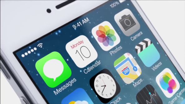
So, let’s just get into the discussion “iOS 7 Little Explained”
For any product or for any kind of software, there is one thing that matters the most, “Is this thought through?”.
Before Show Down:
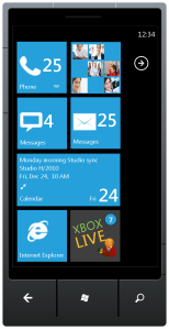
There were rumours and rumours are bad. I heard iOS is going flat, no more shadows, no gradients, no more glossy looking icons, no more real-feel like objects on screen, no more skeuomorphism in design. I felt anxious. I thought if not this what is there that Apple can do better. This is the most special part of Apple with iOS, feeling everything real on screen. Notes App give me a good feel of a desk paper-pad, Reminders app has that particular leather feel and the Weather App provides me everything that I want! It’s all already there. I wondered why they wanna change it? because they were doing it best already. They are setting the trend while all others are trying to copy it and failing. If they are gonna call this massive design scheme off then in what direction would they go? what else do they have to show us. iOS 7 would be under complete coordination of Sir Jonathan Ive (Design) and Crag Federiki (Engineering), I have been following Jonathan Ive’s design schemes for a long time and what initial thought I had was “Ok, iOS would definitely be much more simple, more accurate, less conspicuous”, but the point to think was that where are they gonna fit these. Isn’t iOS already the simplest thing. Certainly there are couple of things that I find painful, like going to setting for turning on/off my wifi or bluetooth network, or sometime when I manually wanna change the brightness. And there is no way of instant file sharing either via bluetooth or wifi. But as far as design is concerned isn’t it’s the easiest one that I am using already. Rumours said that iOS 7 is going to be much like New Windows Mobile OS Design Scheme. And honestly, my reaction to that was “kill me!”. If iOS is going that way there is no way I am upgrading to iOS 7. Windows Mobile OS Design Scheme is neat, no doubt about it; Everything is so scaled and placed on the screen in a very neat manner. But that’s not the simplicity, that’s just the minimisation of content from the screen, there is no order about anything, no harmony across the system, there is just one color theme at an instance, symbols in white only and the OS practically lacks tons of features.
but if that’s how iOS gonna look like, it would be preposterous.
No color scheme, no gradients, no indent level, no strong hinting elements about what a particular symbol does. Things would be clean and neat with this interface but maybe I don’t want that kind of clear interface, it won’t be a clear interface it would just be blank interface like Windows Mobile, I mean how am I gonna judge what’s active button and what’s not, where would be the margin guides, and how would I realize the depth of the objects when there would be no shadows? It would be bizarre.
I wish that Apple just do their “Magical Thing” that they always do and come up with some solution for this, for every bit of this.
The months passed and WWDC 2013 was near I stopped thinking about how I personally think about iOS. Perhaps, I got excited how they would have done it. All the questions were storming my head, I had every detail of feature on my list that I wanna see; how Apple is gonna maintain depth-3D feel effect in the new interface if they are not using shadows, real-objects like interface. And how native Apps are gonna look..
After Show Down:
Apple Event started and I was in hyperactive mode. Just checking where can/if I can spot any thing absurd. There were many things talked before iOS 7 Macbook Air, Mac Pro, Mac OS X Mavericks, it was the grand part according to Apple. Apple CEO Tim Cook played the video hosted by Jony Ive presenting and explaining iOS 7.
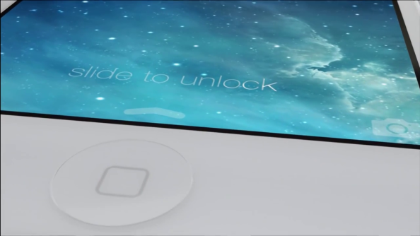
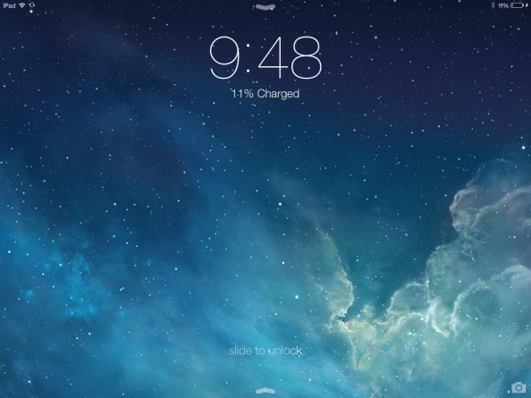
So, what I noticed first? The parallax effect with the “slide to unlock” text as the iPhone moved on screen in video, but I thought that can’t be parallax maybe it’s just the animated background or something. But no it was the actual parallax effect that was implemented following on the physics of the orientation of the phone, how it’s being held and moved around in 3D space.
And that answered my foremost question how are they gonna work without shadows in iOS 7 how will they give the lively feeling that few things are elevated a little than the rest of the objects on screen or as I say one icons are above background. Another thing very noticeable so far was that the text is so thin, though this actually looked much better then the previous bold text, it took the complete advantage of the high pixel density of the retina devices. But I was seriously doubt how they would look on non-retina devices like iPad mini, which is one of the prime product of Apple these days. Within few seconds I was pretty sure this would go bad on non-retina. For that Apple released in it’s iOS 7 beta iteration increasing the font size just as little as it was required to fit for the non-retina screens.
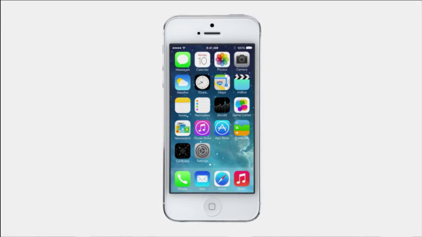
Then the icon color scheme, they are so gluey and sharp, but they say it’s part of the design; ok, we will come back to that later.
Then there was the control centre the most handful feature of iOS 7 making it obvious that I would save enough taps now for changing the brightness, or turning on my bluetooth or orientation lock. It was the most expected and demanded feature and it has to be there. But wait I noticed something else too, the plate that slide up form the bottom with all these options is colorless, not exactly colorless, it’s shady, no not exactly shady it’s blurred. Oh! its like a blur glass giving the shade of what’s behind it. Well, then it should take any shade that’s behind it? Yes it does! giving a very right sense of depth and elevation about the fact that this frame of “Blur Glass” control centre is actually above whatever you are doing behind, and behind there can be icons, calculator App, messaging app or even lock screen. Another thing I spotted inside control centre was AirDrop, which is a file sharing facility between the iOS devices.
This all was right so far but I wasn’t done with all questions in my head, how does everything else works???
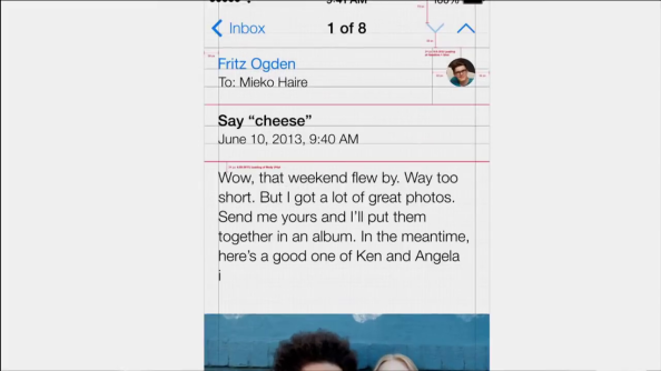
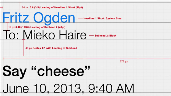
And then there was “Typography”, now few might say what does typography has to do with it? Well, guys if you say that, you have no Idea how much text interface influence the whole system, text is something that we are taught to communicate in since childhood, and most of people think of that the same way. But mind it, it’s just not that; typography explains a lot about the expressions, the feeling, the nature, the hardness of the context. The more refined and well spaced text on screen is, the more you will fetch out of it and more you will make use of it. You will never feel it straight away by just looking and judging. You would deny at some point that maybe it’s absurd, text on the screen is just delivering me message and it’s the message that matters. Well, your psychology says completely different story.
Don’t believe me, ah! sadly I cannot come up with any test about it but when I do, I will surly write about it :] There are some big thoughts that I have just about the typography in general but I think we can save that for another blog-post sometime.
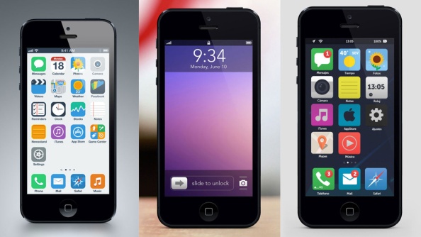
And now finally let’s get to know the idea behind these icons, to be more specific the icons color scheme. About what everyone is talking. I am gonna do an experiment here, let’s me see if I can get you the same feeling and state my point about it. I installed iOS 7 on one of my device and just took all the native Apps with the same color scheme to one folder and hide it to some page. I replace my initial home screen with the App icons like twitter, facebook, wordpress, instagram, podcast and Apps that still has the icons like iOS 6 and compared that new home screen to the previous home screen which was with the native iOS 7 icons. I concluded that right from the lock screen to the home screen to the Apps and then back to the home screen, these icons places a perfect fit. I felt this is it, this is what Jony meant when he said words like “harmony”, “order to complexity” and of-course “simplicity”. Now think like this, if you are the mentor of iOS 7 obviously you would think of what’s best that you can put in every part and should go in implementation. That’s the reason many softwares, many websites and hardware product today lacks perfection in design, because every part of those products does speak for itself that it’s great but they don’t collectively sum up to a great product. Because it is not always that what is best to be placed in the system but what fits with the surroundings in the system is suppose to be there. Only then I believe it gets more functional, more useful, more robust and more correct. I don’t know what you think but according to me the iOS 6 like icons on the right are more eye-hurting while those on the left are soft and clear.
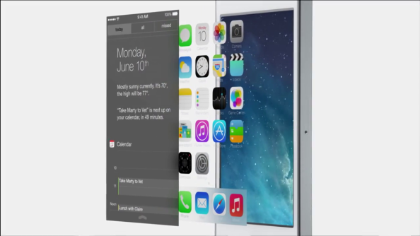
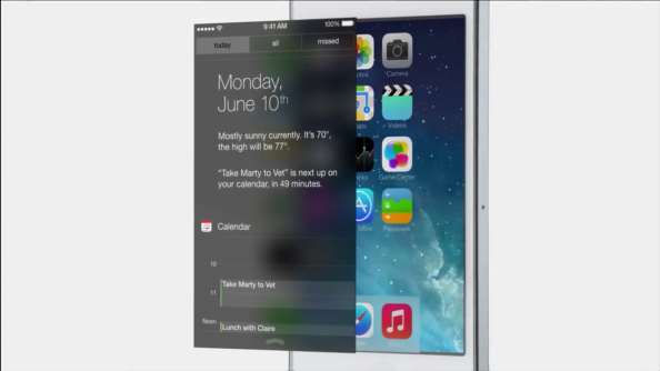
Next let us move to the notification centre, well core here is the same but I see the blur effect giving me the feeling of depth. And something really useful the day, weather and calendar widget, plus the three tabs in segment control on the top make it a filtering options for me to go directly to the stuff I wanna deal with.
Over here initially I had to “tap” on the segment control at the top to select the the view I want to see, like “missed” or “all” but in latest beta iOS 7 they made it easy; with a swipe right-left and left-right gesture to switch between the views. What I feel is handy to me. And another thing compared to the previous design is that this blur glass background with this typography looks and feel way more clear and rich. I see this on my iPhone and I wonder how could I suffice with iOS 6 notification centre. Another thing that I noticed while I was playing around with it that the parallax doesn’t just work with the icon at home state it’s actually across the system while I have my notification centre down or a regular alert popped up on screen and if I move my iPhone around in any orientation the parallax does shows that effect and maybe these are the moments when you say “OMG! Somebody at Apple actually thought of that too!”
And not just the control centre and notification centre; the whole system is translucent, it’s blurred keyboard in messages, in mail the tab bars in music App, in phone App and Siri. It’s like a whole glass like elevated hierarchy system across the whole OS that responds as parallax too in many areas. And that’s the complete answer to my question that how Apple is gonna drop back skeuomorphic design scheme. Now keep this in mind that you will not get this same feeling that I get of such blur glass interface across the whole system by just reading this blog-post you maybe watching some youtube videos repeatedly telling all the features of iOS 7. If you wanna feel it, you have to get one in hand. I am sorry, there is no other way!
Maybe that’s another example where Apple states that implementing something just because it’s technologically possible is absurd. Perhaps thinking over it and thinking again and building a model out of it after numerous iterations, then taking out just right amount of it that’s needed makes every sense to show you care.
Another very different thing that I noticed was that, every App is opening from the icon, is actually zooming large through the icon up to the App window. Like everyone else around me I though why would they do that? Is there something they thought about this too, and then did it? there has to be some strong reason. While I was just playing around with the native Apps I found some similar behaviour within the Apps itself; let me explain with an example, the Calendar App. The first screen of the App shows me the “Year view” with all the months there, now if I tap a particular month, there was no slide left animation bringing new view on screen from right showing that month but what happened was that the the month that was on that year view actually zoom to a month view. Similarly when I taped the day on screen the view opened and shows the day details. So, in this whole course I realize there is very deep sense of bread crumbing and with these kind of transitions user would never loose the context of where he is in the App form where did he reached there and where will he go when he hit back. Let’s say you are never lost, wherever you are in your App, and even if you feel you are, you would surly have a good idea where to navigate next.
No borders to text buttons, no borders to the solid icons what’s that now, How would I know what is the button and what’s just simple text? what is an active button and what disabled button? Don’t you think it would be a storm of confusions? Well, trust me I tried every way to point out holes in this thought of Apple but in the end I was all convinced. Let me explain it to you and before I do that I suggest don’t confuse yourself by just thinking what they would have done to convince, how they would have handled that, it’s impossible to handle, it would sure be hell confusing. Don’t do that! Let’s say you are in Notes App and you wrote something. So, now you have “notes” called button on the left top that’s of yellow shade and the text that you just wrote is solid black; Suddenly you hit the delete trash button at the bottom and an action sheet pops up. See what’s the color of the text button of “Notes” now. You will feel the shade going down in the active text buttons becoming inactive, suggesting they cannot be tapped anymore. But your text is still crisp black. You see, when you will have that sense of experience you won’t just embrace, it would just feel right to you in every way pushing sense to every task you are trying to accomplish. Now that’s where they serve vitality.
I don’t wanna stop writing and all above is not all of it, there is so much more left unexplained and I guess you will eventually reach it. But I don’t wanna make this post too big for anyone to feel lazy and not read it. This was just to give you the idea what’s Apple’s thinking methods behind iOS 7 and pretty much everything they do. There are few personal thoughts that I wanna say before I end this post; Like I mentioned above they build iOS 7 and they did it whole again following “First product-building” approach; They figured the problems again, they started all over again, they gave it their first solution, they iterated over it and didn’t said it’s done until they were sure that it is. It’s tough to improve on perfection. It’s nearly impossible for someone to think beyond his perfect creation done once. And disconnection from the past, building something entirely new, better and delightful in such short duration of time is remarkable. As a consumer no one would give any strong attention to this fact. Apple hater won’t even bother! but as an iOS/Mac Developer this feels really inspiring and convincing that what you are thinking, the way you are thinking, It’s right :]







Suuper Duuper like. great content. Well explained. Always in love with Apple new innivative updates. Great work Apple and Arjun 🙂
Thank you Hamid 🙂
Nicely written. You’ve got impressive knowledge in this case Arjun. Cheers!
Thanks Dauji 🙂
Downloaded the ios 7 and it’s really great but did anyone also notice the lags between sliding screens? is it a beta problem or is something wrong with my version?
got the beta from http://www.ios7down.blogspot.com seems to work ok but i liked the old iOS better!
There is a simple thing to understand; a “beta” for any software product is released to test it among those who are not actually involved in core development of that software. Definitely betas are buggy, they lag a lot and with every iteration in beta release they improve, addressing each issue one by one.
It could be the beta problem. And I suggest you don’t download and install beta to your device form any other site beside Apple’s Developer Portal. Those other betas can be doped.
I don’t really followed the blogspot you just mentioned but if you are really anxious to follow the beta changes and improvement, better register your device to Apple Developer Portal https://developer.apple.com/
And about your last statement, you liking old iOS more; I respect your choice. In-fact I think somewhere iOS wasn’t suppose to change at first place. They could have just added all the missing features like AirDrop and Control Centre. But “People” say they are bored of the previous interface that Apple is following since 1st iPhone, it’s been 5 years and they say they need a change. Apple had to come up with a new Design Scheme. I think what’s most respectable is they didn’t just got an alternative of everything what was already there. They practically thought everything right from the foundation bottom-up, redoing everything!